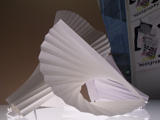
After looking At Sir Norman Fosters work I was able to find the right composition of my folded pleated paper. As it's clear below there is many elements of the sculpture which can relate to architecture.
I found the composition I wanted to use but finding the right angle and depth I wanted to take the final shot for the sculpture to be pushed forward to the 'Final Design'

A low angle made the sculpture look a lot bigger than it actually was but the only problem with this shot is the background doesn't compromise the design.
Using a light box like I before in my earlier development worked really well to produce light from underneath the design. This makes the design stand out more and again makes the sculpture look bigger. The problems with this though was that some areas on the sculpture didn't come out clear and too saturated for the camera to take focus on these areas.
Using a natural light source made the design seem more realistic therefore the white balance on the camera wasn't scaling out of control.


No comments:
Post a Comment