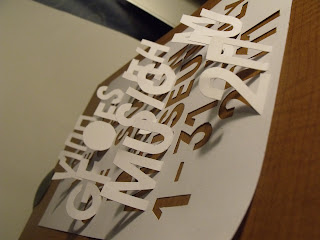
This is my final design for the poster to celebrate the 100th anniversary of GF SMITH. I'm trying to find the right position in which I want the final image to look. The design I have done was made from a piece of a3 paper and I displayed the text on the page by drawing light pencil outlines until I was happy with the layout. Once I was happy with how the txt was looking I started to cut into the txt and raised some letters. My method for this was for none of the text which is stood up not to be blocked by the next row of letters which would be raised so for me to do this there is some letters just cut out. The use of negative space really works and is set in a very 'Art Deco' feel with the contrasting background. This gives the design a very hand crafted feel and look.


Taking a low level angle when shooting the photo made the design look bigger than it was, playing with this illusion was a good effect but because of the low angle not all the text was visible therefore couldn't be read properly.
Trying to get the low angle I wanted and so that the type can be read. Not exactly easy.


Trying different positions, seeing which best work with the look I want. The image above is of the designed piece of paper but flipped over. The type is clear in this design but it doesn't really have the 'wow factor'

Arching the design worked well but when cropping and editing the image on C.A.D program could be found to be a pain because the shape. I do like this design though the type is clear and the arch makes the design stand out more in capturing the 3D effect which I achieved in task 1 of the brief.

I will be taken a few of the positions of the design in to my further development to create my final design. I will edit the images on the computer and add effects etc which i think and feel would make the piece of paper I designed better.


No comments:
Post a Comment